Mine is forest green.
I like glaucous green.
| by Anonymous | reply 1 | August 3, 2019 12:45 AM |
Mine is WHITE
| by Anonymous | reply 2 | August 3, 2019 12:46 AM |
Glaucous green must NOT be confused with the rancid khaki!
| by Anonymous | reply 4 | August 3, 2019 12:49 AM |
Purple
| by Anonymous | reply 6 | August 3, 2019 12:54 AM |
Blush pink
| by Anonymous | reply 7 | August 3, 2019 12:54 AM |
Offsite Link
| by Anonymous | reply 9 | August 3, 2019 12:57 AM |
The very deep did rot: O Christ!
That ever this should be!
Yea, slimy things did crawl with legs
Upon the slimy sea.
| by Anonymous | reply 10 | August 3, 2019 12:57 AM |
Blue. Duh.
| by Anonymous | reply 11 | August 3, 2019 12:59 AM |
White
| by Anonymous | reply 13 | August 3, 2019 1:03 AM |
White
| by Anonymous | reply 17 | August 3, 2019 1:06 AM |
Too many to name. I adore robin egg blue too, though the one upthread is what I would call “robin egg green.” Oddly, one of my current favorites though it’s not in my house (and won’t be) is chartreuse. I desperately needed something unmuted, unneutral, unsoftened, undusky, ungrayed. We have been in the era of gray for over a decade now, I just get sooooooooooo tired of it. True, it is safe — one can’t make many mistakes with grays. However, one also cannot take risks or be playful with them either!
| by Anonymous | reply 18 | August 3, 2019 1:18 AM |
Chartreuse
| by Anonymous | reply 20 | August 3, 2019 1:23 AM |
Green
| by Anonymous | reply 21 | August 3, 2019 1:23 AM |
White
| by Anonymous | reply 23 | August 3, 2019 1:36 AM |
What’s YLNMN Blue? Whatever it is, it is beautiful!
| by Anonymous | reply 25 | August 3, 2019 1:53 AM |
BURNT ORANGE in a leader
| by Anonymous | reply 26 | August 3, 2019 1:56 AM |
OP: Move to Eugene, Oregon.
| by Anonymous | reply 27 | August 3, 2019 1:58 AM |
R27, but where do you move when you nominate chartreuse? Or purple?
| by Anonymous | reply 28 | August 3, 2019 2:02 AM |
The color chartreuse is what prompted me to make this post! I love that color as well... it's such a strange, vibrant one. It should be off putting, but I love it.
| by Anonymous | reply 29 | August 3, 2019 2:15 AM |
Brown.
| by Anonymous | reply 30 | August 3, 2019 2:18 AM |
Queen Elizabeth's Royal Family Order is on chartreuse silk. What could be more prestigious!?!
| by Anonymous | reply 31 | August 3, 2019 2:25 AM |
R29, I have a terrible terrible secret to tell you. You know what made me fall in love with chartreuse? Patricia. Of Southern Charm. Her house was done by the great interior designer Mario Buatta. Behold! You’ll love it even more.
I live in Chicago — our gray winter light would destroy chartreuse. Part of why it’s so magical in her home is the sunlight.
| by Anonymous | reply 32 | August 3, 2019 2:26 AM |
Another vote for purple.
| by Anonymous | reply 33 | August 3, 2019 2:30 AM |
British khaki- for leather. Volvo used to outfit their cars in a G.I. Joe bionic arm orange and I love that one as well.
| by Anonymous | reply 34 | August 3, 2019 2:30 AM |
Salmon pink.
| by Anonymous | reply 35 | August 3, 2019 2:31 AM |
Cerulean.
| by Anonymous | reply 36 | August 3, 2019 2:32 AM |
Royal claret, the accent color of the Queen’s State Bentley...because royalty, expensive cars, and booze.
| by Anonymous | reply 37 | August 3, 2019 2:34 AM |
Sandringham Claret over black was the Rolls Royce color reserved for the royals. Interesting that the new Phantom VI given to her in 2017 was simply referred to as royal claret.
| by Anonymous | reply 38 | August 3, 2019 2:51 AM |
chartreuse
turquoise
other shades of blue and green
| by Anonymous | reply 39 | August 3, 2019 2:56 AM |
Puce
| by Anonymous | reply 40 | August 3, 2019 3:13 AM |
R40, "Puce is the French word for flea. The color is said to be the color of bloodstains on linen or bedsheets, even after being laundered, from a flea's droppings, or after a flea has been crushed."
| by Anonymous | reply 41 | August 3, 2019 3:29 AM |
It depends on what it is. I wear a lot of blue and black, I enjoy jewel-type colors on furniture fabric, etc. My eye seems to be drawn to things that are a vivid red (not sure of the name).
| by Anonymous | reply 44 | August 3, 2019 9:23 AM |
Every blue, blue is The best.
| by Anonymous | reply 45 | August 3, 2019 9:25 AM |
Chartreuse all the way, baby.
| by Anonymous | reply 46 | August 3, 2019 9:29 AM |
Grün
| by Anonymous | reply 47 | August 3, 2019 9:31 AM |
R43 That's beautiful!
| by Anonymous | reply 48 | August 3, 2019 9:41 AM |
Chartreuse is as ugly as Eau-de-Nil ( i.e. the putrid, cholera-carrying waters of the River Nile
| by Anonymous | reply 49 | August 3, 2019 9:53 AM |
Hahaha, R49 that shade of green is gorgeous. I've never heard of it before. Thanks for sharing!
| by Anonymous | reply 50 | August 3, 2019 10:07 AM |
Never, EVER pair up Eau-de-Nil with Burnt Orange. It will give you nightmares.
| by Anonymous | reply 51 | August 3, 2019 10:28 AM |
[quote]Never, EVER pair up ANYTHING with Burnt Orange. It will give you nightmares.
Fixed.
| by Anonymous | reply 52 | August 3, 2019 10:33 AM |
I will slap your head with a Huarache, r52.
| by Anonymous | reply 53 | August 3, 2019 10:41 AM |
As long as it's not Burnt Orange, r53...
| by Anonymous | reply 54 | August 3, 2019 10:46 AM |
Prussian blue
| by Anonymous | reply 55 | August 3, 2019 12:19 PM |
I couldn't choose between Green and Purple. I love them in deep warm shades.
| by Anonymous | reply 56 | August 3, 2019 12:29 PM |
Salmon pink
| by Anonymous | reply 57 | August 3, 2019 12:59 PM |
Which of these is true Prussian blue? They all look a little different to me.
| by Anonymous | reply 58 | August 3, 2019 1:17 PM |
Burnt Sienna
Periwinkle
| by Anonymous | reply 60 | August 3, 2019 1:39 PM |
I always think of Teal as a shade of blue. It is, of course, blue-green.
| by Anonymous | reply 62 | August 3, 2019 2:15 PM |
the whole purple family - purple, lavender, lilac, violet, etc
| by Anonymous | reply 64 | August 3, 2019 4:21 PM |
^ I see that as a Burgundy or a Deep Scarlet rather than brown.
| by Anonymous | reply 66 | August 3, 2019 5:07 PM |
R58, Prussian Blue is the deepest of the ones you picked. Think of it almost if you combined sapphire with navy. There is NO hint of green, teal, gray, nothing but a deep blue. It is a true shade, not a neutral gray. Color Theory 101:
Hue = Color
Tint = Color + White
Shade = Color + Black
Neutral Gray = Color + Black + White
When I was an art student in Color Theory, our painting teacher explained neutral grays this way. “The cheap clothes most of you buy that are grays are just shades or tints. True designer clothing have their fabric custom dyed using neutral grays because they are 1000 times more interesting.”
I also quickly learned from Color theory that neutral grays are how you make rich gorgeous flesh tones using complementary colors plus black and white. For example, my pale Polish ass required blue + orange + White + Black. However, to save money I also learned to start with white and gradually mix in the other color, this was true regardless of skin color. One of my figure painting models was Egyptian/Mediterranean. For her I would use red + green + White + Black because she was more olive complected.
| by Anonymous | reply 67 | August 3, 2019 5:11 PM |
Turquoise
| by Anonymous | reply 68 | August 3, 2019 5:26 PM |
[quote]What’s YLNMN Blue? Whatever it is, it is beautiful!
YlnMn Blue is supposed to be first new blue pigment identified in the last 200 years. Artists and designers made it all the rage a few seasons ago, but really, the average person can't tell YInMn Blue from Cobalt Blue or Ultramarine Blue.
| by Anonymous | reply 69 | August 3, 2019 6:36 PM |
[quote]What’s YLNMN Blue? Whatever it is, it is beautiful!
YlnMn Blue is supposed to be first new blue pigment identified in the last 200 years. Artists and designers made it all the rage a few seasons ago, but really, the average person can't tell YInMn Blue from Cobalt Blue or Ultramarine Blue.
| by Anonymous | reply 70 | August 3, 2019 6:36 PM |
Kelly Green
| by Anonymous | reply 71 | August 3, 2019 6:42 PM |
All of them.
| by Anonymous | reply 72 | August 3, 2019 6:46 PM |
Russian red
| by Anonymous | reply 73 | August 3, 2019 7:07 PM |
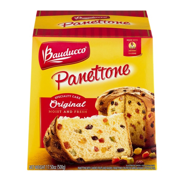
The warm reddish-brown above looks like it's from Pannetone trend colors of Spring/Summer 2019.
| by Anonymous | reply 74 | August 3, 2019 7:23 PM |
Indigo.
| by Anonymous | reply 75 | August 3, 2019 7:29 PM |
Thank you, R67. And you, too, r74. I love it when I can learn something.
| by Anonymous | reply 76 | August 3, 2019 7:36 PM |
Marrs green, the World's Favorite Color in 2017. One of my favorites since forever.
| by Anonymous | reply 77 | August 3, 2019 7:40 PM |
Marrs green, the World's Favorite Color in 2017. One of my favorites since forever.
| by Anonymous | reply 78 | August 3, 2019 7:40 PM |
The color of a beautiful blue sky.
| by Anonymous | reply 80 | August 3, 2019 7:48 PM |
I have heard that yellow is an unsinful colour.
| by Anonymous | reply 81 | August 3, 2019 7:53 PM |
Brown, yellow, and orange are all a sin.
| by Anonymous | reply 82 | August 3, 2019 7:57 PM |
I'd certainly like to be able to buy a desk model of the Anglepoise lamp in this story.
| by Anonymous | reply 83 | August 3, 2019 8:12 PM |
R76, Updating Panettone's colors for autumn/winter 2019-2020.
| by Anonymous | reply 84 | August 4, 2019 4:02 AM |
I hate green and yellow
| by Anonymous | reply 85 | August 4, 2019 4:04 AM |
I don't understand hating a color. They're all great depending on the context. Except for forest green, which is always great.
| by Anonymous | reply 86 | August 4, 2019 4:06 AM |
Sapphire Blue
| by Anonymous | reply 87 | August 4, 2019 4:58 AM |
Yellow and red — Panettone’s colors of forever
| by Anonymous | reply 89 | August 4, 2019 5:26 AM |
Gastric brown
| by Anonymous | reply 92 | August 4, 2019 8:10 AM |
Celadon
| by Anonymous | reply 94 | August 5, 2019 2:10 AM |
Purple.
| by Anonymous | reply 95 | August 5, 2019 2:13 AM |